


Welcome to the last blog of the series EDA 101: Explore, Discover, Analyze. So, if you were reading through the whole series, then till now you must have gained knowledge to answer questions like, What is Data analysis? What all kinds of data are present throughout the web on which you can work? What's the best way to analyze the data? what are the best tools for EDA? Why Visualization plays an important role in interpreting the data?
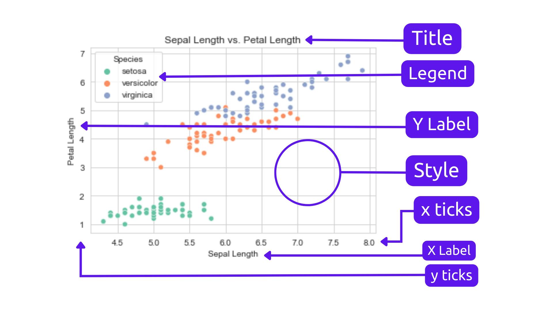
I'm going to end this series by discussing our bonus topic which is how can we customize the visualization and make it more appealing and attractive. Generally, in plots and graphs, it is done by changing the colors, adding a few more necessary labels, changing the size, etc. and concluding the series with a nice brief on all the things we've discussed. Before we begin here is a detailed labeling of the graph, to give you the names of each bone in the skeleton
This time we are going to deal with these elements of a graph, instead of plotting graphs( which I already did ) we'll try to beautify one. So, here is how you can customize plots using Seaborn.
Customizing Plots with Seaborn ✨✨:
Titles and Labels
Adding titles and labels to your plot is essential as it provides context to your visualizations. The Seaborn library makes it easy to add titles and labels to your plots.
import seaborn as sns
import matplotlib.pyplot as plt

# Load the iris dataset
iris = sns.load_dataset('iris')

# Create a scatter plot of the iris dataset
sns.scatterplot(x='sepal_length', y='sepal_width', data=iris)

# Set the plot title and axis labels
plt.title('Sepal Length vs Sepal Width')
plt.xlabel('Sepal Length')
plt.ylabel('Sepal Width')

# Display the plot
plt.show()

Colors and Styles
Seaborn provides several color palettes and styles to customize the appearance of your plots. You can use the
sns.set_palette()function to change the color palette, and thesns.set_style()(such as darkgrid, whitegrid, dark, white, ticks) function to change the plot style.
import seaborn as sns
import matplotlib.pyplot as plt

# Load the tips dataset
tips = sns.load_dataset('tips')

# Create a bar plot of the total bill amount by day
sns.barplot(x='day', y='total_bill', data=tips)

# Set the color palette and plot style
sns.set_palette('Set2')
sns.set_style('ticks')

# Display the plot
plt.show()

Annotations and Text
Annotations and text can be used to highlight important features or provide additional context to your plots. Seaborn provides several functions to add annotations and text to your plots.
import seaborn as sns
import matplotlib.pyplot as plt

# Load the diamonds dataset
diamonds = sns.load_dataset('diamonds')

# Create a scatter plot of diamond prices by carat weight
sns.scatterplot(x='carat', y='price', data=diamonds)

# Add annotations for the largest and smallest diamonds
plt.annotate('Largest Diamond', xy=(2.5, 18000), xytext=(2, 13000),
             arrowprops=dict(facecolor='black', shrink=0.05))
plt.annotate('Smallest Diamond', xy=(0.2, 350), xytext=(0.5, 1000),
             arrowprops=dict(facecolor='black', shrink=0.05))

# Add a text box with additional information
plt.text(0.1, 20000, 'Diamond Prices by Carat Weight')

# Display the plot
plt.show()

Axis Limits and Ticks
Seaborn provides several functions to customize the axis limits and ticks of your plots. You can use the
sns.despine()function to remove the top and right spines of the plot, and theplt.xlim()andplt.ylim()functions to set the limits of the x and y axes.
import seaborn as sns
import matplotlib.pyplot as plt

# Load the titanic dataset
titanic = sns.load_dataset('titanic')

# Create a histogram of passenger ages
sns.histplot(x='age', data=titanic)

# Remove the top and right spines
sns.despine()

# Set the x-axis limits and ticks
plt.xlim(0, 80)
plt.xticks([0, 20, 40, 60, 80])

# Set the y-axis label
plt.ylabel('Count')

# Display the plot
plt.show()

Adding legends
If you have multiple groups or categories in your data, you can add a legend to help differentiate them. You can use the
hueparameter in the plotting function to create a legend based on a categorical variable in your dataset. Thesns.legend()function can be used to customize the legend's location, title, and other properties.
import seaborn as sns
import matplotlib.pyplot as plt

# Load the iris dataset
iris = sns.load_dataset('iris')

# Create a scatter plot of sepal length vs. petal length, with hue based on species
sns.scatterplot(x='sepal_length', y='petal_length', hue='species', data=iris)

# Customize the legend
plt.legend(loc='upper left', title='Species')

# Set the plot title and axis labels
plt.title('Sepal Length vs. Petal Length')
plt.xlabel('Sepal Length')
plt.ylabel('Petal Length')

# Display the plot
plt.show()

Saving Plots
Seaborn provides several functions to save your plots to a file. You can use the
plt.savefig()function to save your plot to a file in various formats such as PNG, PDF, or SVG.
import seaborn as sns
import matplotlib.pyplot as plt

# Load the tips dataset
tips = sns.load_dataset('tips')

# Create a scatter plot of total bill amount by tip amount
sns.scatterplot(x='tip', y='total_bill', data=tips)

# Set the plot title and axis labels
plt.title('Total Bill Amount vs Tip Amount')
plt.xlabel('Tip Amount')
plt.ylabel('Total Bill Amount')

# Save the plot to a file
plt.savefig('scatterplot.png')

These were a few ways you can customize your plots. Now, you can create informative and attractive visualizations that help you gain insights from your data.
Conclusion 🏁:
At last, we have come to the end of our EDA 101: Explore, Discover, Analyze series. After completing this series, most FAQs are going to be What to do next?? So, now you need to go analyze some great insights from the data available on the internet and create awesome visualizations for those insights by yourself, you don't have to be correct every time, at first you'll face some problems, and there is a scope for mistakes, just be calm and whenever you get confused or forget things (there is nothing wrong in forgetting things) just get back to this series and learn again, you can always revisit. and even I'll update this series thoroughly with new insights, if there is any necessity, and make it even more informative for beginners. by the end of this series, we have answered a lot of questions from all five parts. These are all the links for previous blogs, so do check them out:
-> EDA 101: Explore, Discover, Analyze (Part-1)
-> EDA 101: Explore, Discover, Analyze (Part-2)
-> EDA 101: Explore, Discover, Analyze (Part-3)
-> EDA 101: Explore, Discover, Analyze (Part-4)
I hope you enjoyed the “EDA 101: Explore, Discover, Analyze” blog series. Stay tuned for upcoming blogs where I’ll delve into the world of Data science sharing my insights and knowledge and helping the Data Science community to grow.
If you have any questions or would like to share your insights on Data Science, feel free to reach out on Twitter @lokstwt. I’d love to hear from you and you can support me by buying me a coffee! Peace ✌🏾.